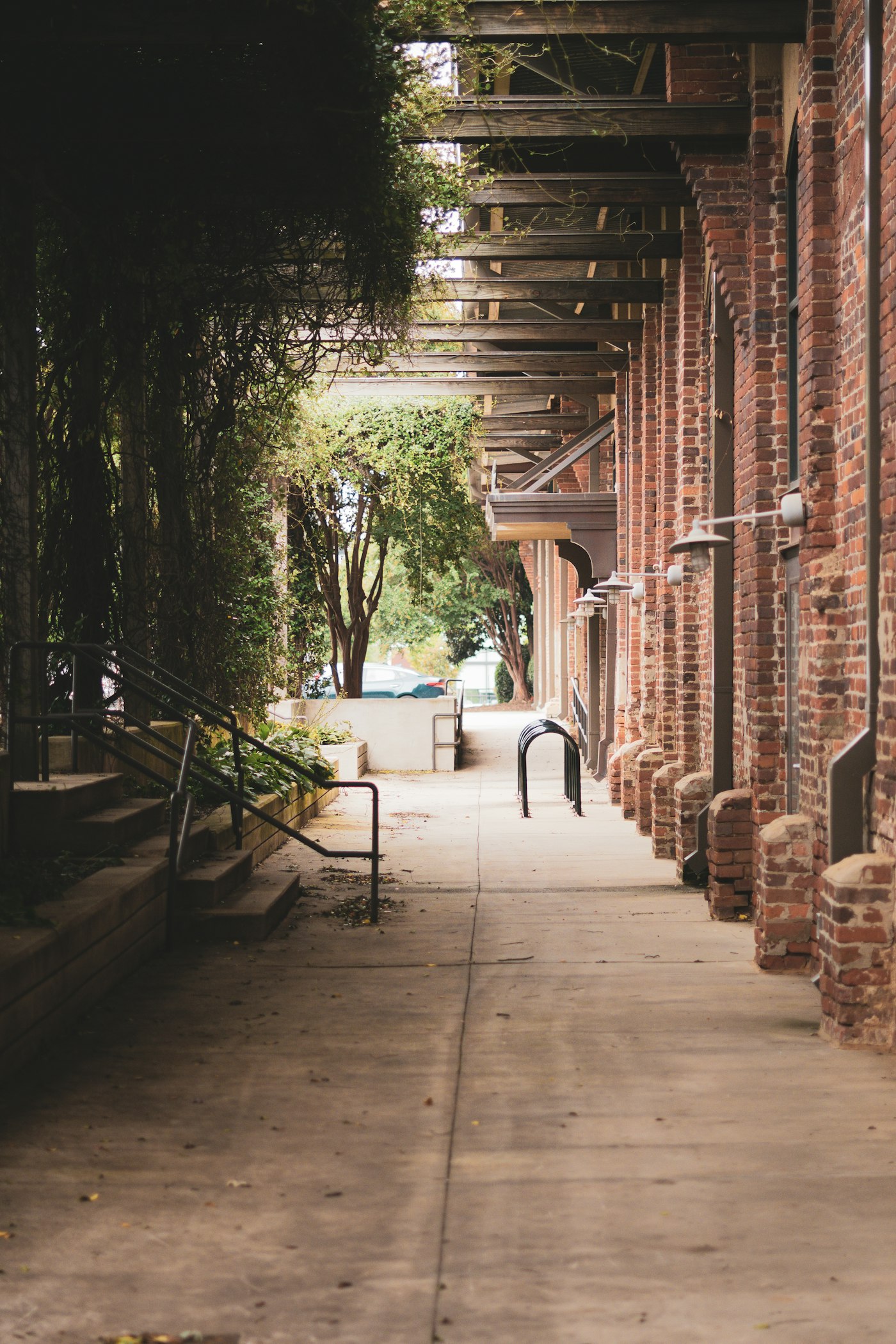
01Streets and courtyards
Shade, seating and planting for the places people pass through every day. Small moves that make a street worth slowing down in.
- Street and square design
- Courtyard planting
- Paving and lighting plans
Fernhollow, landscape architecture
From a single courtyard to a whole valley, every project starts with a long walk around the site.
Shade, seating and planting for the places people pass through every day. Small moves that make a street worth slowing down in.
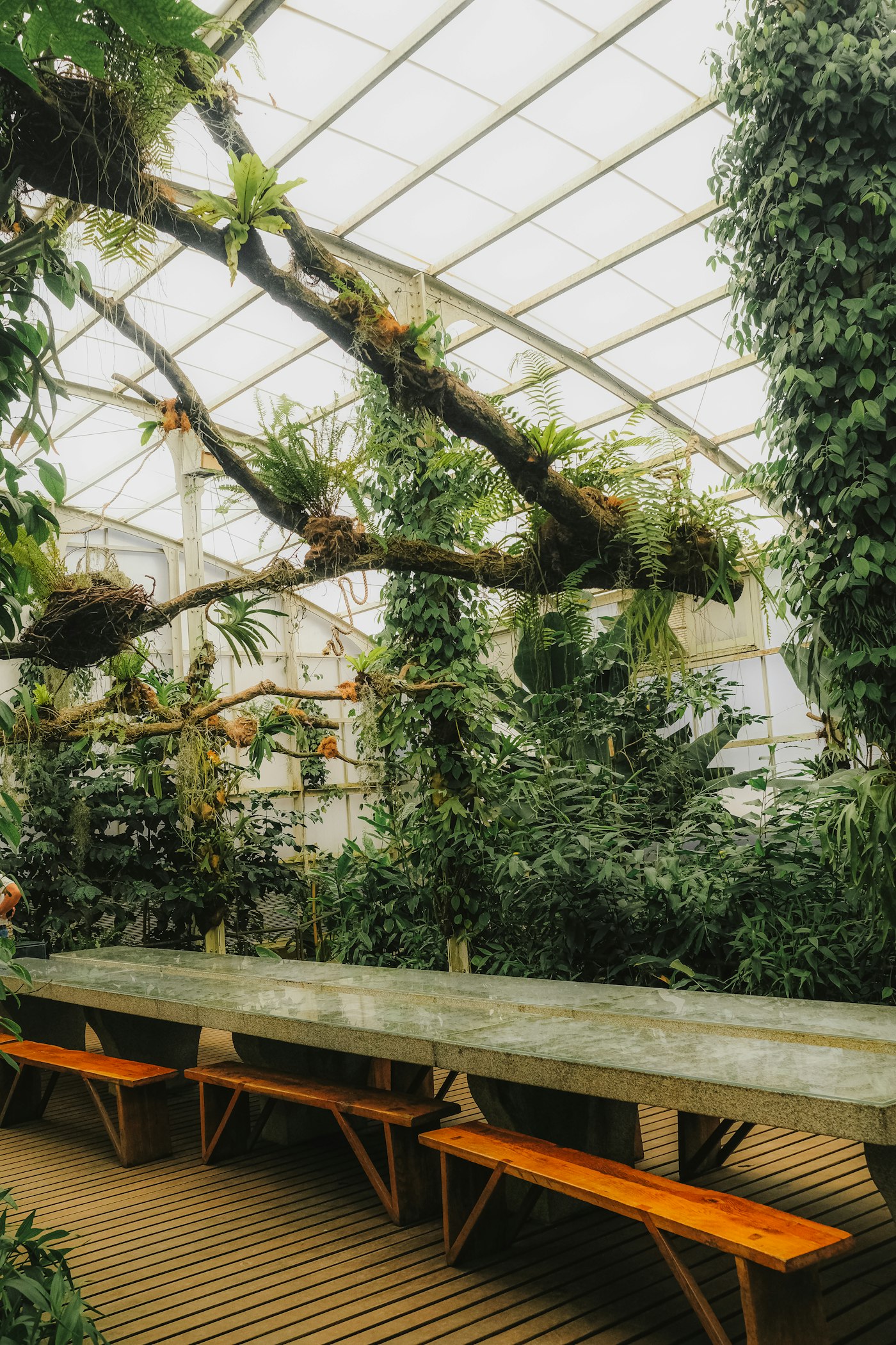
Glasshouses, atriums and winter gardens planted to thrive indoors. We work with the building from the first sketch, not after it.
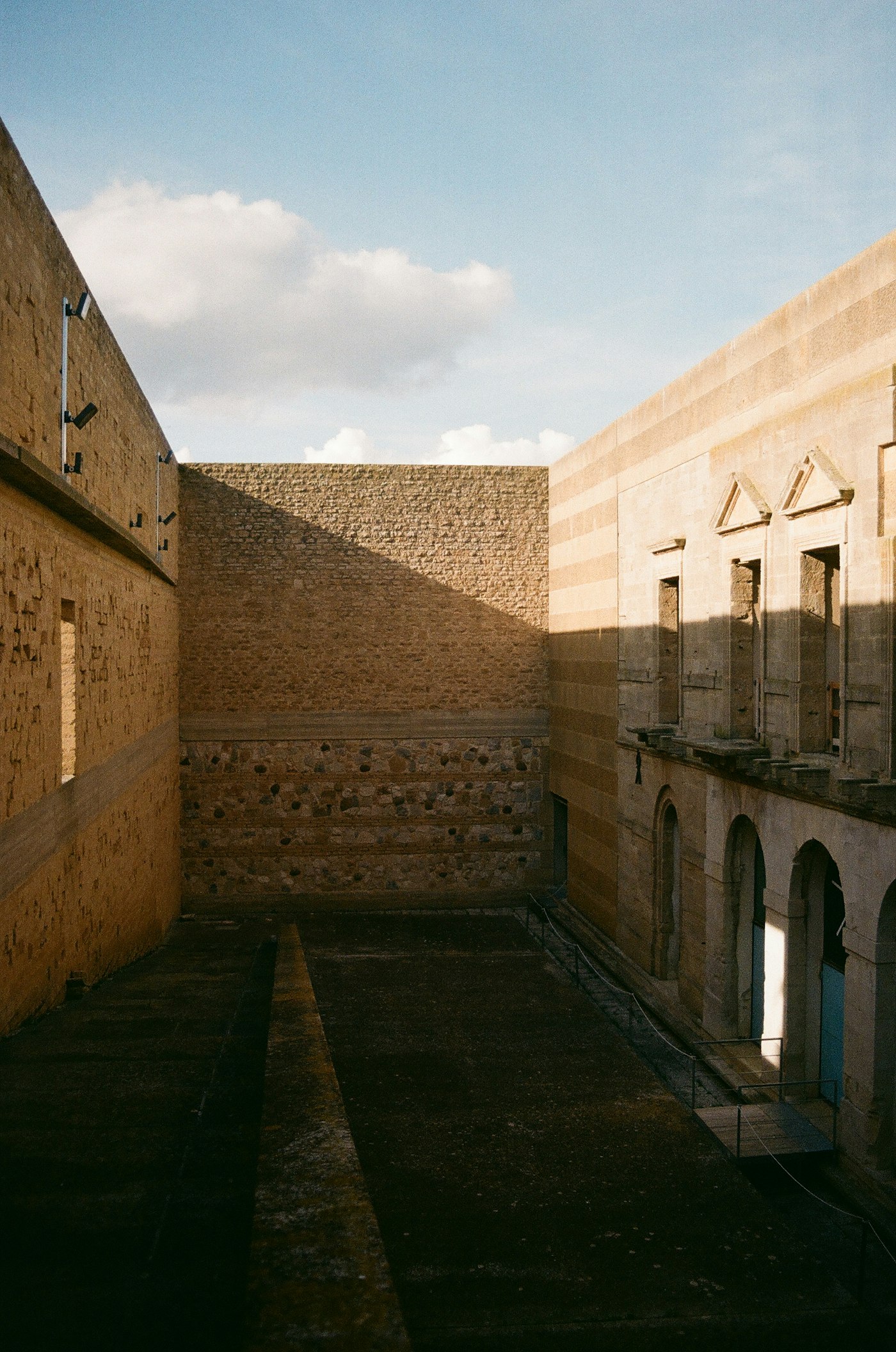
Walls, steps and quiet courts built from local stone. Materials that weather well and stay cool through the longest summers.
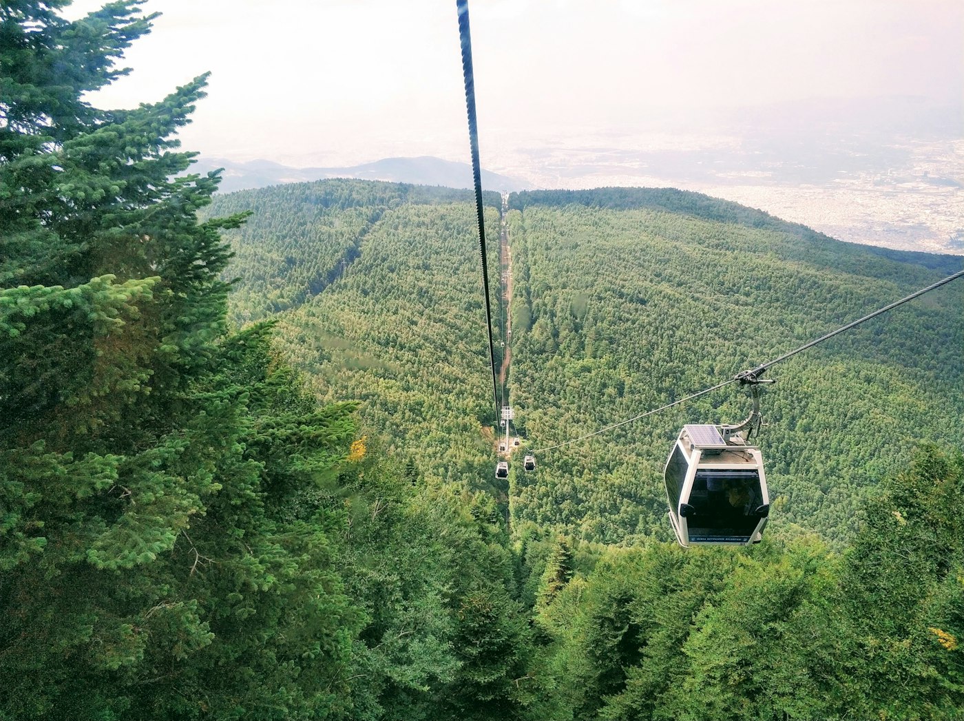
Routes that lead people into wild places without wearing them away. Paths, lookouts and crossings drawn around what is already there.
Farms and estates planned for harvests and for habitat at the same time. Hedgerows, water and soil treated as one system.
Every project starts with a walk.
A pinned scroll feature section for a landscape architecture studio built on the scroll-rail component, set on a dark surface. A header with an eyebrow, heading and one-line intro stays fixed at the top while five wide service slides travel sideways beneath it as the page scrolls. Each slide pairs a tall photograph that moves slower than its frame with a large thin numeral, the service title, two sentences, a short list of deliverables between hairlines and an underline link, and the text brightens as its slide reaches the middle. A closing line with an Arrow Pill ends the rail, and a hairline along the bottom fills with progress. On phones the slides stack the photograph above the text. Reduced motion turns the rail into a plain horizontal scroll.
A pinned, dark scroll section: the header stays put while wide service slides (photo, numeral, title, text, deliverables, link) travel sideways on a ScrollRail driven by page scroll, with each photo drifting slower than its frame and a hairline at the bottom filling with progress.
Upgrade to Pro
Pro blocks install through the shadcn CLI with your license key and ship their full source. Docs and live previews stay open to everyone, so you can read every block's details first.
Swap YOUR_EMAIL and YOUR_KEY for the email and license key on your account. Find your license key on your account page.
Radix flavor
npx shadcn add "https://ui.beste.co/r/feature315?email=YOUR_EMAIL&license_key=YOUR_KEY"Base UI flavor
npx shadcn add "https://ui.beste.co/r-base/feature315?email=YOUR_EMAIL&license_key=YOUR_KEY"This installs the block to components/beste/block/feature315.tsx plus the scroll-rail component and the button23 and button2 buttons it uses.
The installed file exports feature315Demo alongside the block: the exact props behind the preview above. Spread it to get a working section in one line.
import { Feature315, feature315Demo } from "@/components/beste/block/feature315";

export default function Page() {
  return <Feature315 {...feature315Demo} />;
}
Then replace the demo with your own props. Written out, a trimmed setup looks like this:
import { Feature315 } from "@/components/beste/block/feature315";

export default function Page() {
  return (
    <Feature315
      eyebrow="Fernhollow, landscape architecture"
      heading="Five ways we work with land."
      description="Every project starts with a long walk around the site."
      services={[
        {
          title: "Streets and courtyards",
          text: "Shade, seating and planting for the places people pass through every day.",
          deliverables: ["Street and square design", "Courtyard planting"],
          image: {
            src: "https://images.unsplash.com/photo-1727743112098-d21f8a4c36b5?w=1400&q=80",
            alt: "A covered brick walkway lined with climbing plants",
          },
          link: { label: "Learn more", href: "/services/streets" },
        },
        {
          title: "Gardens under glass",
          text: "Glasshouses, atriums and winter gardens planted to thrive indoors.",
          image: {
            src: "https://images.unsplash.com/photo-1784451233418-36f10d5c046c?w=1400&q=80",
            alt: "Wooden benches under a glass roof full of trees and ferns",
          },
        },
      ]}
      closing="Every project starts with a walk."
      button={{ label: "Book a site visit", href: "https://beste.co" }}
      rail={{ gap: 40, smoothing: 0.5 }}
    />
  );
}| Prop | Type | Default | Description |
|---|---|---|---|
eyebrow | string | – | Small line above the heading |
heading | string | – | Section heading, rendered as an h2 |
description | string | – | Intro line on the right of the header on desktop |
services | Service[] | [] | One slide per service, in travel order |
closing | string | – | Large line on the closing panel at the end of the rail |
button | ActionButton | – | Arrow pill under the closing line |
rail | Omit<ScrollRailProps, "className" | "children" | "progress" | "autoplay" | "align"> | – | Forwards ScrollRail props (gap, smoothing, speed, paused); progress, autoplay and alignment are set by the block |
className | string | – | Extra classes for the outer <section> |
type ActionButton = {
  label: string;
  href: string;
};

type Service = {
  title: string;
  text: string;
  deliverables?: string[];
  image: { src: string; alt: string };
  link?: ActionButton;
};360svh tall with a sticky stage of 100svh minus 78px (at least 640px). Rail progress maps page scroll from 2% to 96% of the section onto 0 to 1, clamped, and the same value scales the bottom hairline.data-rail-depth="0.14", and the desktop numeral uses 0.2, so both drift against the travel. The text block uses data-rail-focus="0.35" and brightens as its slide nears the middle.md the big numeral and the deliverables list are hidden, the numeral moves inline before the title, and the photo stacks above the text.closing or button is set. Slide titles are h3.34rem height.