Selected Work Rail
Northfold, selected work 2019 to 2026
Made to be looked at twice.
A design studio of eleven people working on identity, packaging and spaces for companies that plan to be around for a while.
Northfold, selected work 2019 to 2026
A design studio of eleven people working on identity, packaging and spaces for companies that plan to be around for a while.
A pinned scroll feature section for a design studio built on the scroll-rail component: the eyebrow, heading, intro, an Arrow Pill and an underline link stay fixed in a header row while a rail of large project cards slides sideways beneath as the page scrolls. Each card is a link with a cover photograph that drifts inside its frame, the client, year, a one-line summary and the disciplines, and it dims gently until it reaches the middle. A closing panel with a project count and an Arrow Pill ends the rail, and a thin hairline under the rail shows how far along it is. Every rail setting passes through the rail prop. Reduced motion turns the rail into a plain horizontal scroll.
A pinned scroll section where a header row (eyebrow, heading, intro and two buttons) stays fixed while a rail of project cards slides sideways beneath it, each cover photo drifting inside its frame, followed by an optional closing panel and a hairline that fills with the scroll.
Upgrade to Pro
Pro blocks install through the shadcn CLI with your license key and ship their full source. Docs and live previews stay open to everyone, so you can read every block's details first.
Swap YOUR_EMAIL and YOUR_KEY for the email and license key on your account. Find your license key on your account page.
Radix flavor
npx shadcn add "https://ui.beste.co/r/feature314?email=YOUR_EMAIL&license_key=YOUR_KEY"Base UI flavor
npx shadcn add "https://ui.beste.co/r-base/feature314?email=YOUR_EMAIL&license_key=YOUR_KEY"This installs the block to components/beste/block/feature314.tsx plus the scroll-rail component and the button23 and button2 buttons it uses.
The installed file exports feature314Demo alongside the block: the exact props behind the preview above. Spread it to get a working section in one line.
import { Feature314, feature314Demo } from "@/components/beste/block/feature314";

export default function Page() {
  return <Feature314 {...feature314Demo} />;
}
Then replace the demo with your own props. Written out, a trimmed setup looks like this:
import { Feature314 } from "@/components/beste/block/feature314";

export default function Page() {
  return (
    <Feature314
      eyebrow="Selected work 2019 to 2026"
      heading="Made to be looked at twice."
      description="A design studio working on identity, packaging and spaces."
      buttons={[
        { label: "Start a project", href: "/contact" },
        { label: "Meet the studio", href: "/about" },
      ]}
      projects={[
        {
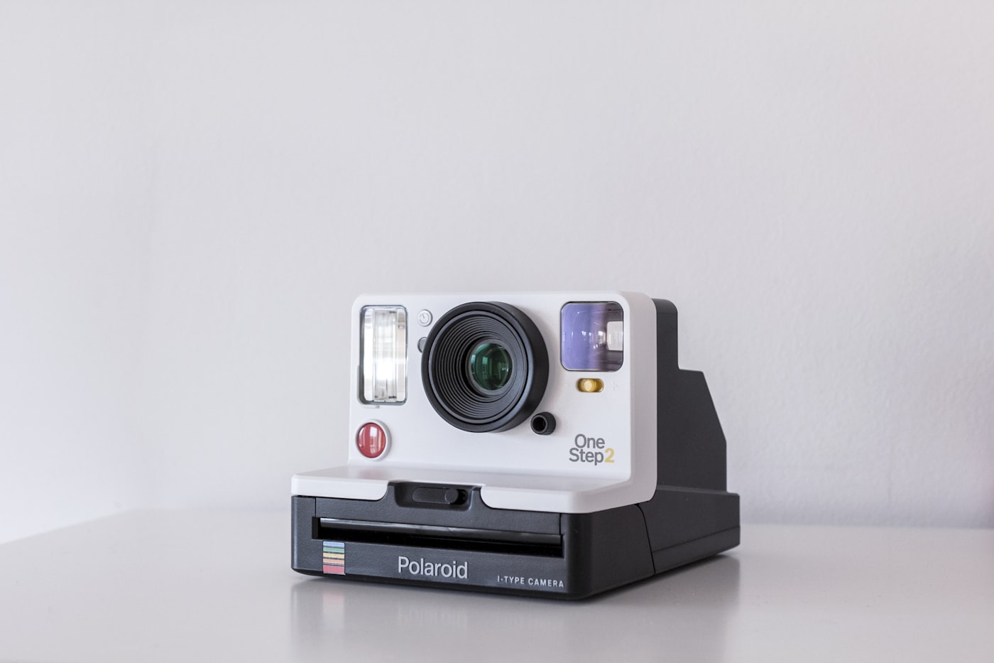
          client: "Halden Optics",
          summary: "A camera body and the whole world around it",
          disciplines: "Product, identity",
          year: "2025",
          image: "https://images.unsplash.com/photo-1526170375885-4d8ecf77b99f?w=1400&q=80",
          imageAlt: "A camera photographed on a plain backdrop",
          href: "/work/halden",
          shape: "landscape",
        },
        {
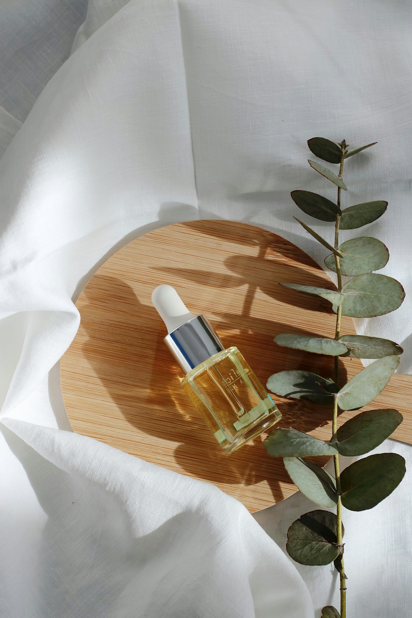
          client: "Oriel Botanicals",
          summary: "Packaging for a small line of plant oils",
          disciplines: "Packaging, art direction",
          year: "2024",
          image: "https://images.unsplash.com/photo-1617897903246-719242758050?w=1400&q=80",
          imageAlt: "A dropper bottle of golden oil on a round wooden board",
          href: "/work/oriel",
          shape: "wide",
        },
      ]}
      more={{ heading: "48 projects since 2014", label: "See all work", href: "/work" }}
      rail={{ gap: 40, align: "stretch", smoothing: 0.5 }}
    />
  );
}| Prop | Type | Default | Description |
|---|---|---|---|
eyebrow | string | – | Small line above the heading |
heading | string | – | Section heading, rendered as an h2 |
description | string | – | Intro paragraph in the right column of the header |
buttons | ActionButton[] | [] | The first renders as a dark Button23 arrow pill, the rest as Button2 underline links |
projects | Project[] | [] | Cards along the rail, each a link to its href |
more | MoreCard | – | Closing panel after the last project |
rail | Omit<ScrollRailProps, "children" | "progress" | "autoplay" | "className"> | – | Forwards the ScrollRail component's props (gap, align, speed, smoothing, paused) |
className | string | – | Extra classes for the outer <section> |
type ActionButton = {
  label: string;
  href: string;
};

type Project = {
  client: string;
  summary: string;
  disciplines: string;
  year: string;
  image: string;
  imageAlt: string;
  href: string;
  shape?: "landscape" | "wide"; // 4 by 3 or 16 by 10, default "landscape"
};

type MoreCard = {
  heading: string;
  description?: string;
  label: string;
  href: string;
};h-[320svh] tall with a sticky inner frame, and rail travel maps scroll progress from 0.03 to 0.95 onto 0 to 1, so the rail rests briefly at both ends.landscape) or 1.6 (wide), capped at 82vw.data-rail-depth="0.14", so it drifts against the travel, and the caption block uses data-rail-focus="0.5" to dim until its card reaches the middle. Hovering a card scales the cover to 1.03.scaleX, so both always agree.progress={0} and becomes a plain horizontal scroll, the header skips its rise-in and the hairline is not rendered.autoplay is always off here; the rail only moves with the page.