Fragrance Orbit Hero
Maison Aubade
Worn close, remembered far.
Ember No. 9 opens on bitter orange and settles into smoked amber and fig leaf. Composed by Sade Adu in Grasse, poured in batches of 400.
Maison Aubade
Ember No. 9 opens on bitter orange and settles into smoked amber and fig leaf. Composed by Sade Adu in Grasse, poured in batches of 400.
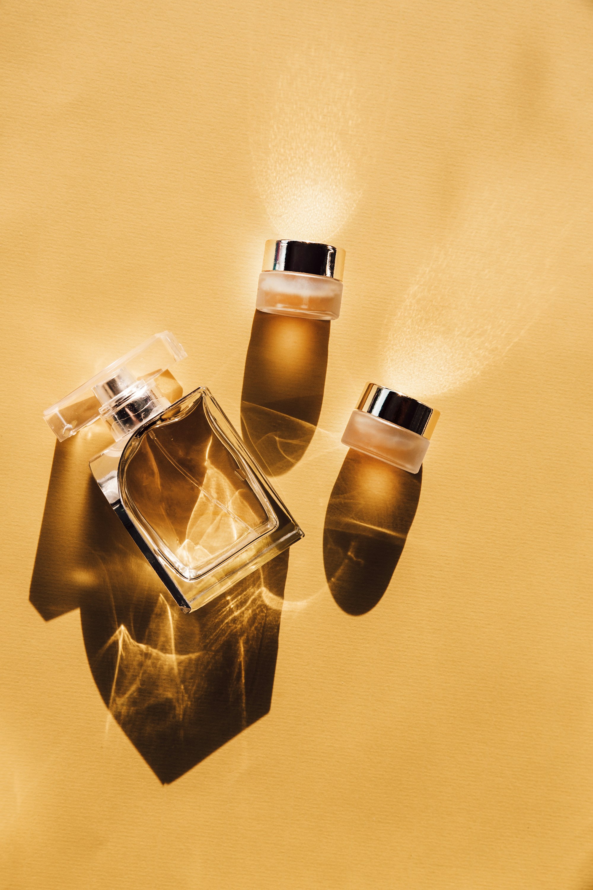
A luxury perfume hero built on the text-orbit component: a circular product photo encircled by three rings of serif text on SVG paths, each turning at its own speed and direction, one tilted into a Saturn-like orbit that passes behind and in front of the bottle. The object leans toward the cursor in 3D, sways on its own without a pointer and floats over a soft reflection beside a light serif headline, a description, a primary Arrow Pill and an underline link. Every orbit setting passes through the orbit prop.
A full-height hero where a round product photo is circled by rings of serif text on SVG paths through the text-orbit component, each turning at its own speed and one tilted into an orbit that passes behind and in front of the photo, beside a light serif headline, an intro, an Arrow Pill in the theme's primary color and an underline link.
Upgrade to Pro
Pro blocks install through the shadcn CLI with your license key and ship their full source. Docs and live previews stay open to everyone, so you can read every block's details first.
Swap YOUR_EMAIL and YOUR_KEY for the email and license key on your account. Find your license key on your account page.
Radix flavor
npx shadcn add "https://ui.beste.co/r/hero223?email=YOUR_EMAIL&license_key=YOUR_KEY"Base UI flavor
npx shadcn add "https://ui.beste.co/r-base/hero223?email=YOUR_EMAIL&license_key=YOUR_KEY"This installs the block to components/beste/block/hero223.tsx plus the text-orbit component and the button23 and button2 buttons it uses.
The installed file exports hero223Demo alongside the block: the exact props behind the preview above. Spread it to get a working hero in one line.
import { Hero223, hero223Demo } from "@/components/beste/block/hero223";

export default function Page() {
  return <Hero223 {...hero223Demo} />;
}
Then replace the demo with your own props. Written out, a trimmed setup looks like this:
import { Hero223 } from "@/components/beste/block/hero223";

export default function Page() {
  return (
    <Hero223
      eyebrow="Maison Aubade"
      heading="Worn close, remembered far."
      description="Ember No. 9 opens on bitter orange and settles into smoked amber and fig leaf."
      buttons={[
        { label: "Discover Ember No. 9", href: "/ember" },
        { label: "Book a scent consultation", href: "/consultation" },
      ]}
      image={{
        src: "https://images.unsplash.com/photo-1622618991746-fe6004db3a47?w=2000&q=80",
        alt: "A clear glass perfume bottle and two small jars casting amber shadows on warm paper",
      }}
      orbit={{
        rings: [
          { text: "Ember No. 9 · Eau de parfum · 50 ml ·", radius: 1.04, speed: 1, depth: 70, size: 6.4 },
          { text: "Composed in Grasse · Poured by hand ·", radius: 1.32, speed: 0.7, tilt: 74, size: 5.6 },
        ],
        imageScale: 1.7,
        imageFocus: "28% 56%",
        color: "var(--primary)",
        reflection: true,
      }}
    />
  );
}| Prop | Type | Default | Description |
|---|---|---|---|
eyebrow | string | – | Muted line above the headline |
heading | string | – | Light serif headline, rendered as the page h1 |
description | string | – | Intro under the headline |
buttons | ActionButton[] | [] | The first renders as a primary Arrow Pill (Button23), the rest as underline links (Button2) |
image | { src: string; alt: string } | – | Round photo at the center of the orbit |
orbit | Omit<TextOrbitProps, "image" | "className"> | – | Forwards the TextOrbit props from the text-orbit component (rings, image zoom and focus, ring color, speed, tilt, sway, reflection, interactive, paused) |
className | string | – | Extra classes for the outer <section> |
type ActionButton = {
  label: string;
  href: string;
};

type TextOrbitRing = {
  text: string;
  radius?: number;
  speed?: number;
  direction?: "clockwise" | "counterclockwise";
  tilt?: number;
  depth?: number;
  size?: number;
};text repeats to close its circle; tilt in degrees turns a ring into an orbit that passes behind and in front of the photo, and depth floats it toward the reader.0.92 over 2 seconds on mount, skipped for reduced motion.bg-background ground with a soft radial glow of the primary color behind the object, foreground text and muted-foreground copy. The demo sets the ring color to var(--primary), and any CSS color works there.lg, with the copy above the orbit.